
To Little
Web application designers have been using the 'less is more' mantra now for a few years but there is a growing trend towards applications that, in various ways, don't do enough.
TODOLIST is a good example of this.
I just signed-up and was confronted by this…
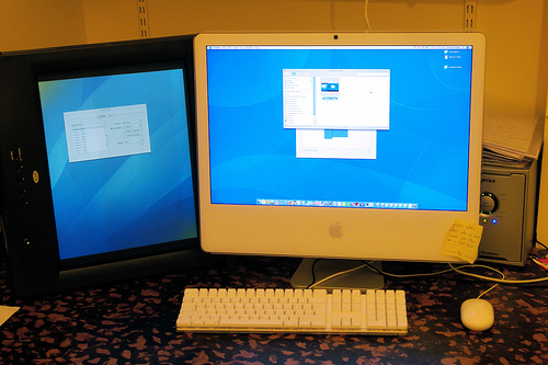
…an interface that's oversimplified to the point that I was left with little choice but to go into the help system to find out what to do.
I'm not sure what this aplication's like to use once you get used to it but unfortunately it's so awkward to learn that I'm not going to stick around to find out.
There's too much attitude and not enough research/user-testing/knowledge behind some applications. It's not enough to adopt the trappings of industry leaders, you have to understand where they're coming from too.
By the way, this is how it looks in Camino
Rant over.